

Shell’s logo is one of the most recognizable brand symbols in the world. But how did a simple seashell become a global icon representing innovation, trust, and fuel for over a century? In this blog post, we’ll uncover the fascinating story behind Shell’s iconic designs, from its humble beginnings to the bold red-and-yellow motif known today. Whether you’re a design lover, brand historian, or vintage collector, this story reveals why Shell’s branding remains a powerful example of visual identity done right.
“Good design is honest, timeless, and tells a story — Shell’s logo is all three.”
Origins: From Real Shells to a Global Brand
The name “Shell” traces back to the late 1800s, when the company was importing oriental seashells from Asia. These natural products inspired the brand’s first visual symbol—a realistic mussel shell. But it wasn’t until 1904 that Shell introduced the scallop shell (or pecten) that would become the brand’s signature.
The Evolution of the Shell Logo
Shell’s logo has undergone multiple transformations, each reflecting the design trends of its time:
- 1904 – The first stylized pecten logo appears in black and white
- 1930s–1940s – A bolder, simplified form emerges with increased symmetry
- 1948 – Introduction of red and yellow colors, inspired by Shell’s operations in California and Spanish heritage
- 1971 – Legendary designer Raymond Loewy creates the modern, minimalist version we know today—still in use with slight refinements
Each evolution wasn’t just aesthetic—it represented progress, modernization, and Shell’s growing global presence.
The Power of Red and Yellow
Color plays a key role in Shell’s visual identity. The striking red and yellow palette not only stands out in crowded environments like gas stations, but also taps into emotional psychology—signaling warmth, energy, and reliability. These colors also honored Shell’s ties to Spain, helping the brand connect with its Californian customer base in the early 20th century.
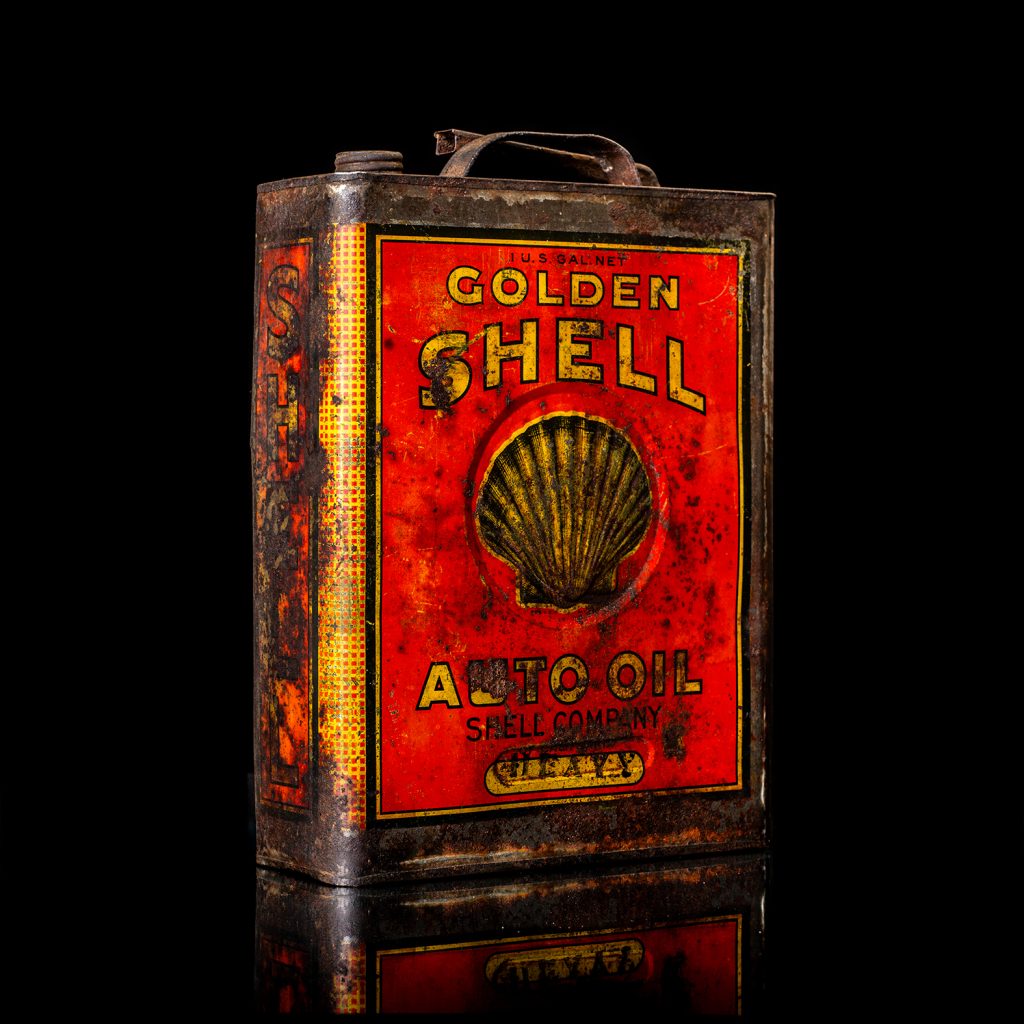
Iconic Applications: From Oil Cans to Enamel Signs
Beyond the logo itself, Shell’s branding extended to vintage oil cans, metal signage, and roadside advertisements that became collectibles in their own right.
Collectors today seek out early Shell cans with embossed logos, triangular shapes, and hand-painted enamel signs, not only for their rarity but because they embody a visual history of branding excellence.
Why Shell’s Design Legacy Matters Today
- Timeless identity: Few brands have maintained such strong visual continuity for over 100 years
- Global recognition: The Shell logo is instantly recognized in over 70 countries
- Inspiration for designers: Shell’s story is taught in branding courses worldwide
Conclusion
The Shell logo isn’t just a design—it’s a story of heritage, adaptation, and impact. From its seashell roots to Loewy’s modern minimalism, the journey of Shell’s branding is a masterclass in how thoughtful design can transcend time, borders, and industries.
If you’re a fan of brand history, vintage advertising, or iconic design, keep following our blog for more deep dives into the most memorable visual identities in history.

Leave a Reply