The red-and-yellow logo—instantly recognizable—belongs in the ranks of iconic brand marks such as Coca-Cola, Philips, Mercedes, and McDonald’s. The shell symbol is of immense value to Shell and is therefore cherished and protected. The usage guidelines for both the logo and Shell’s corporate identity are laid down in a number of official manuals.
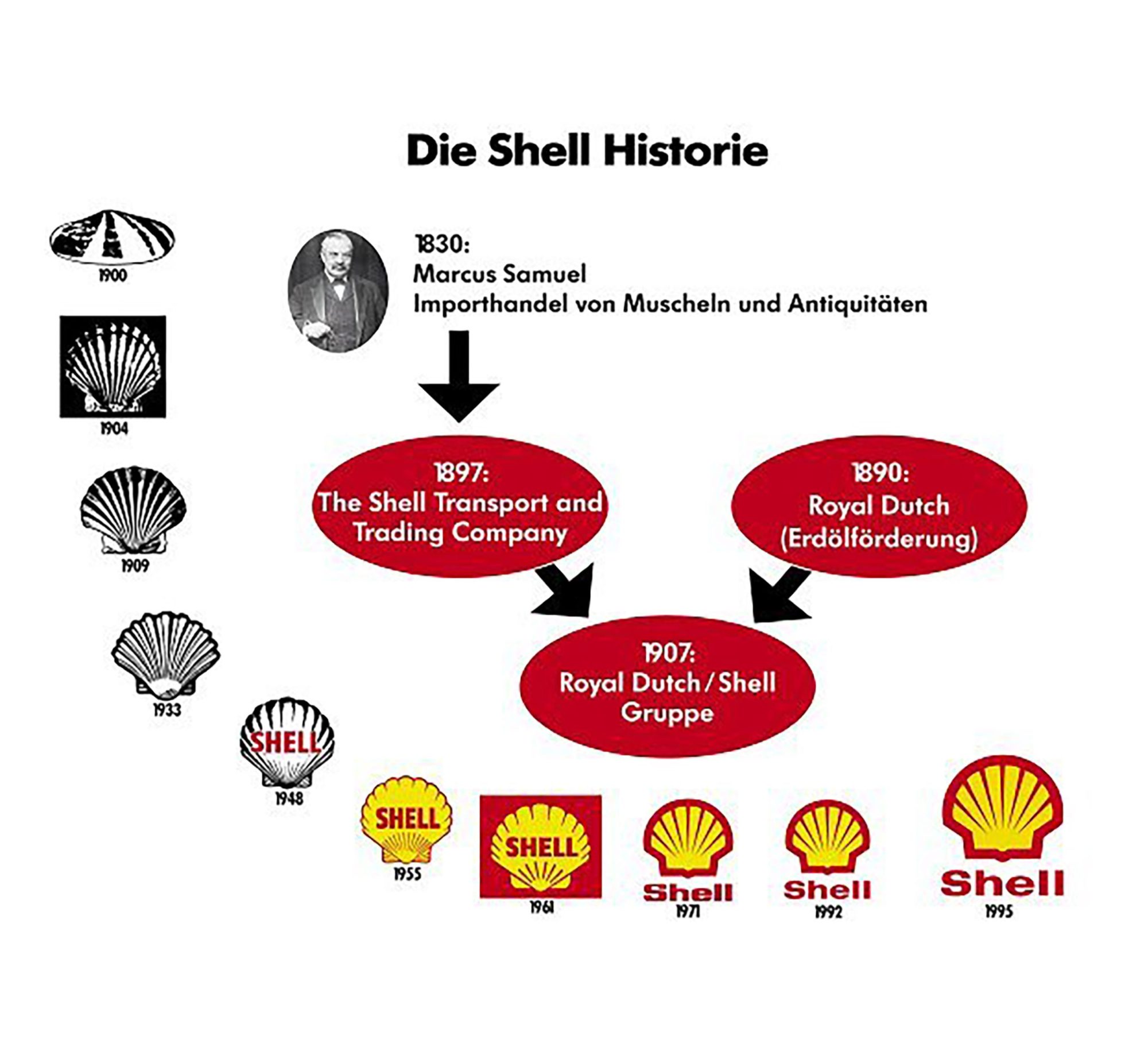
The origin of the shell dates back to the 19th century, with the London-based trading company Samuel & Co. This firm, founded in 1830, dealt in decorative Japanese seashells. It was an era of growing international connections and rapidly expanding trade between Great Britain and the Far East.
By the late 19th century, Samuel & Co. expanded its operations into the oil trade—an emerging market that was growing at a spectacular rate. The youngest member of the Samuel family was looking for a fitting name for the company, which was primarily transporting shells and lamp oil. It was Samuel senior who came up with the solution: Shell Transport and Trading Company Ltd.
Choosing a shell as the brand mark was an obvious step. In 1900, this was still a mussel shell. Four years later, that was replaced by the first version of what would become Shell’s iconic symbol: a scallop shell with a ridged edge.
A Merger of Strengths
In 1907, the Royal Dutch Petroleum Company (N.V. Koninklijke Nederlandsche Petroleum Maatschappij) and the Shell Transport and Trading Company Ltd. merged their operations. The shell remained the brand mark of this new entity, which was named the Royal Dutch/Shell Group.
The origin of the red and yellow colors goes back to 1915, when Shell Company of California began building its first service stations. In a highly competitive environment, standing out was essential. And since California had strong historical ties to Spain, the red and yellow colors of the Spanish flag were chosen.
World-renowned industrial designer Raymond Loewy was commissioned in the 1960s to modernize the Shell logo, as it was difficult to see from a distance or under poor lighting at fuel stations.
The most significant change Loewy made was removing the word “Shell” from the emblem. By then, the logo was so widely recognized that the shell alone was enough to associate the brand. This resulted in the streamlined shell symbol we still see everywhere today.
Royal Dutch Shell Becomes Simply Shell
Since 1907, “Royal Dutch Petroleum Company” and “Shell Transport” had formed the Royal Dutch/Shell Group. In 2004, this structure was deemed insufficiently flexible for modern business practices, which require transparency and accountability.
On July 20, 2005, shares in Royal Dutch Shell were traded for the first time on the stock exchanges. The Royal Dutch/Shell Group became a single business under British law: Royal Dutch Shell plc (plc stands for “public limited company,” the UK equivalent of a Dutch N.V.).
In December 2021, it was decided to move Royal Dutch Shell’s headquarters to London and to simplify its name to just Shell. This was part of a broader corporate restructuring that also relocated Shell’s tax residency entirely to the United Kingdom. At the end of January 2022, the move was completed, marking the end of Shell’s 114-year presence in The Hague.
What is now called Shell Campus The Hague continues to oversee Shell’s extensive operations in the Netherlands as the national headquarters, while the Shell Centre in London is now the company’s global head office.


Leave a Reply